Quickest way to create custom reports for GitHub


Available on GitHub Marketplace
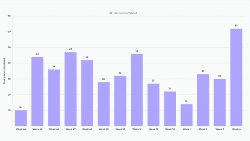
Analytics & Reports
When you purchase Screenful via the GitHub Marketplace, the cost of Screenful is included in your GitHub bill.
Automated project reporting made easy for everyone


"Really good looking views and easy setup. Ideal for providing open visibility for the progress across the company."
Learn how to automate your GitHub reporting
Browse our recent blog posts and product updates
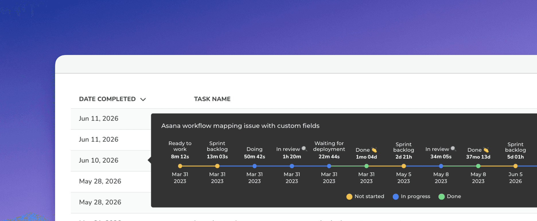


Get started in minutes with Templates
Get started quickly with ready-made templates. Pick a template, then tailor the report and every chart exactly how you want.