
Create advanced charts using Trello custom fields
Jan 24, 2025
Custom fields allow extending Trello's standard fields with your own fields. A typical use case is to add a number field for work estimate for the task (e.g. in hours or story points) but it doesn't have to stop there as you can add multiple fields to capture different types of information.
There are five different custom field types in Trello: Number, Date, Dropdown, Checkbox, and Text. Read on to learn how to create bar charts, number charts, line charts, scatter plot charts, table charts, and more, using data in your Trello custom fields.
Contents:
Integrating Trello with Screenful
Screenful provides multidimensional analytics of the data in Trello. You can slice & dice your data with 15 different chart types, and click through to drill into details.
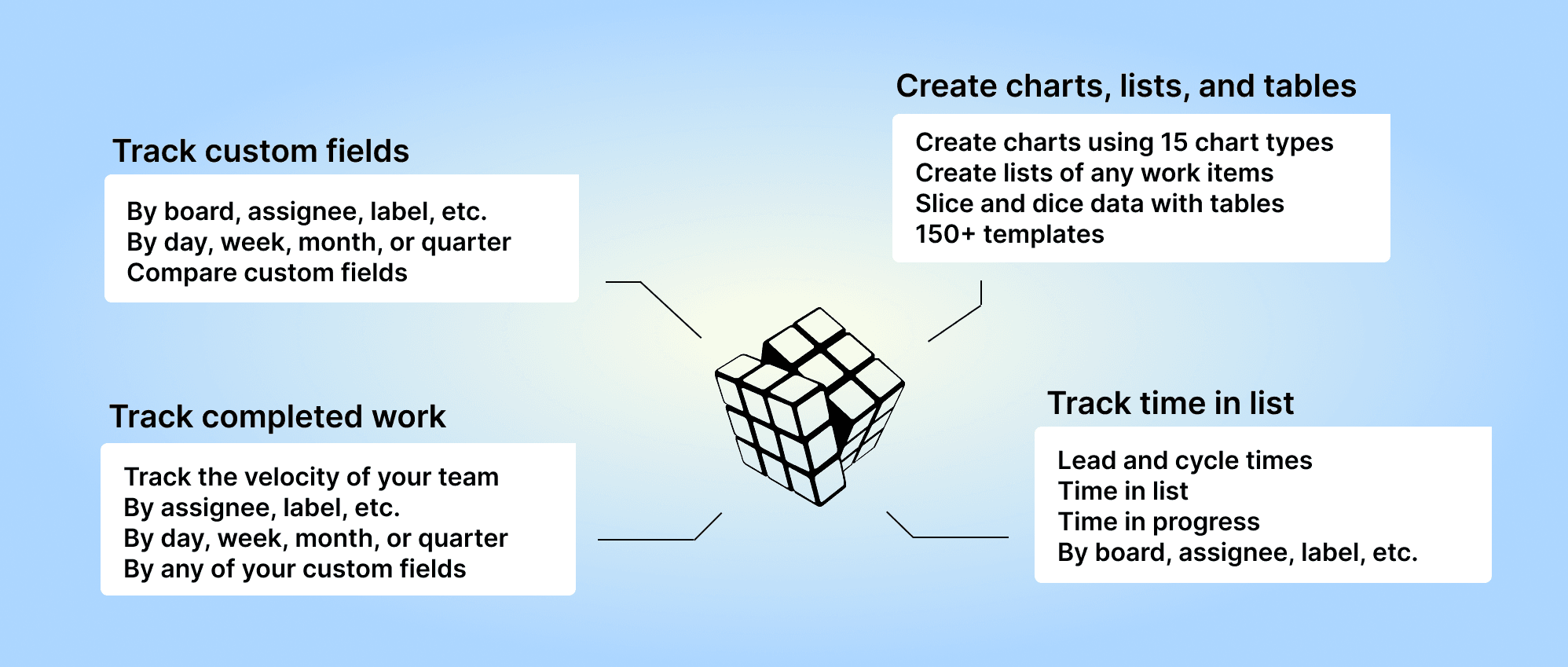
Analytics & Reports by Screenful is available as Trello Power-Up. For more information, see the guide for setting up Screenful with Trello.
Creating charts using Trello Number fields
Your Trello Number fields can be used as a unit of a chart. For example, if you have assigned estimates for tasks (e.g. hours or story points) using a custom numeric field, you can select it as a unit for a chart.

Screenful will automatically make all numeric fields available in the Unit menu in the chart editor.
What if you have multiple number fields and want to have all of them in one chart? Let’s assume you want to compare the values of three different number fields over time. You can do that by adding them to a multi-bar chart. First, pick one of the custom fields as the unit for the chart. After that, use the Add custom field button to add the other two fields:

Here’s the final chart with three different metrics grouped by week:

If you have a Dropdown field that you'd like to use as a unit, you can change the default field mapping.
Creating charts using Trello Dropdown fields
By default, your Trello Dropdown fields are available for grouping and filtering. When you are creating a chart that has a grouping option, you'll find all your select menus in the Group by menu:

When you want to filter the chart content, you'll find your select menus in the Filter window:

Here's a Stacked bar chart stacked by a single select field Component:

By default, your Dropdown fields are available for grouping and filtering. If you want to group & filter by Text fields, you can adjust the default field mapping.
Creating charts using Trello Date fields
All your Trello Date fields are automatically imported and made available for charts. Let's assume you have a custom date field, Date completed, on your board. By selecting Date completed as the metric for the chart, you can create a chart that shows how many items have the date in the past.

That will work the same way as if you had selected Completed (within date range), except that it will only look at the value in the date field. If the date is in the past, it is considered completed, regardless of the workflow state of that item.
Here's the resulting chart:

You can also create Task lists and filter them by custom date columns. Here's an example configuration for a Task list:

When you pick a date column from the menu, the resulting task list contains items that have the date within the specified date range:

You can track any number field by any date field. You can pick a number field from the Unit menu:

In this example, I have selected Deal value as the unit and by Completion date as the metric for the chart. Here's the resulting chart:

The chart shows the deal value generated during the selected period based on the Completion date column.
Creating charts using Trello Text fields
Your Trello Text fields are automatically imported and available for charts. By default, they are mapped in Screenful to Text type, which means they can be used as a column in a Task list.

If you want to use your text fields for grouping and filtering, you can change the default mapping at Data Mapping->Custom Fields:

In this example, the Text field Hours Estimation is mapped to Text. Clicking the row opens it for editing:

Selecting Group & Filter from the menu enables using the field for grouping and filtering.
Creating charts using Trello Checkbox fields
Your Trello Checkbox fields are automatically imported and available for charts. By default, they are mapped in Screenful to Text type, which means they can be used as a column in a Task list.

Here's the resulting chart:

If the checkbox is checked, the value true is shown. Otherwise, the value is empty.
To learn more about advanced reporting for Trello, check out the Guide. You can see all the available charts on the Tour page.
Let us know if you have questions or feedback by contacting hello@screenful.com. To stay on the loop, read our blog, or follow us on LinkedIn.
