
Create advanced charts with GitHub Projects custom fields
Aug 23, 2024
This tutorial shows how to create advanced charts with Screenful using data from any custom fields in GitHub Projects. Learn how to make bar charts, number charts, line charts, scatter plot charts, table charts, and more, using data from GitHub Projects.
You can see all available charts on the Tour page. Read on to learn how to create charts using GitHub Project as a data source.
Contents:
Integrating Screenful with GitHub
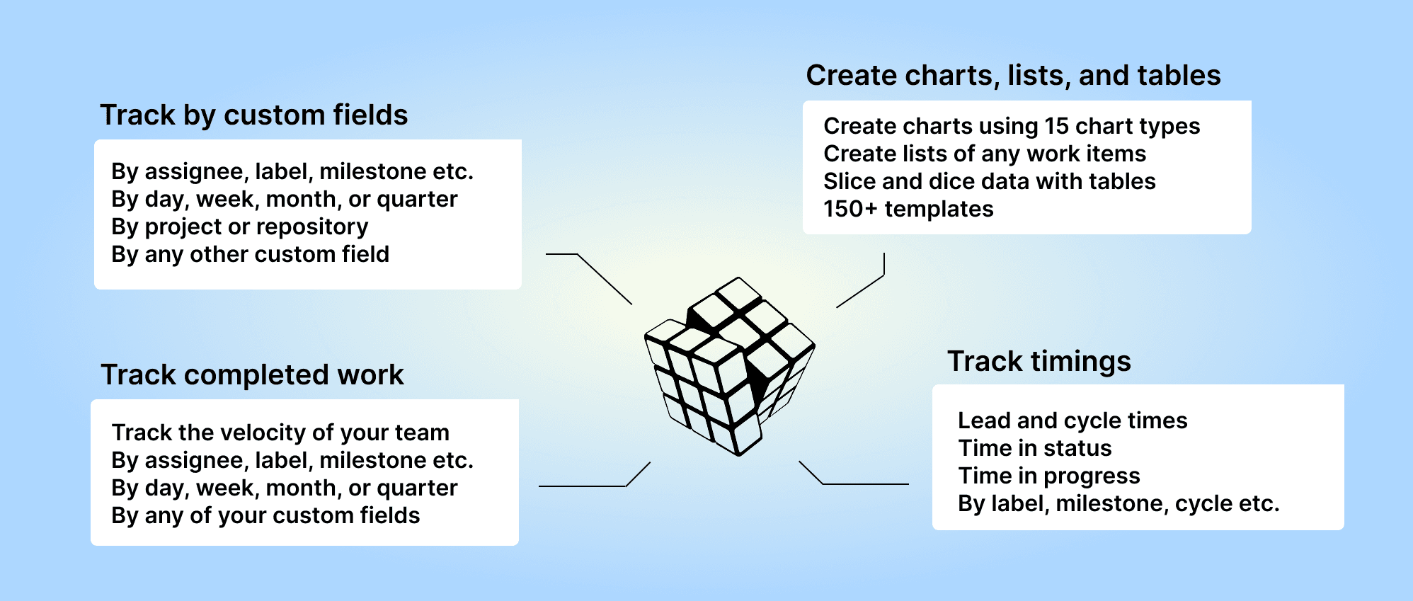
Screenful provides multidimensional analytics of the data in GitHub. You can slice & dice your data with 15 different chart types, and click through to drill into details.
To get started, start a free trial via the GitHub Marketplace. For more information, see the guide for setting up Screenful with GitHub.
Creating charts using Number fields
Your GitHub Projects Number fields can be used as a unit of a chart. For example, if you have assigned estimates for tasks (e.g. hours or story points) using a custom numeric field, you can select it as a unit for a chart.

Screenful will automatically make all numeric fields available in the Unit menu in the chart editor.
What if you have multiple number fields and want to have all of them in one chart? Let’s assume you want to compare the values of three different number fields over time. You can do that by adding them one by one into a multibar chart. First, pick one of the custom fields as the unit for the chart. After that, use the Add custom field button to add the other two fields:

Here’s the final chart with three different metrics grouped by week:

Creating charts using Single Select fields
When you are creating a chart that has a grouping option, you'll find all your select menus in the Group by menu;

All drop-down columns are automatically available in the grouping and filtering menus.
When you want to filter the chart content, you'll find your select menus in the Filter window:

Here's a Stacked bar chart stacked by a single select field Component:

By default, your Single select fields are available for grouping and filtering.
Creating charts using Date fields
Let's assume you have a custom date field Date completed on your board. You can create a chart that shows how many issues have the date within the selected period by selecting by Date completed as the metric for the chart.

That will work the same way as if you had selected Completed (within date range), except that it will only look at the value in the date field. If the date is in the past, it is considered completed, regardless of the workflow state of that item.
Here's the resulting chart:

Creating charts using Iteration fields
All your GitHub Projects Iteration fields are automatically imported and available for charts. You can use the Iteration field for grouping and filtering. You can also create a burndown chart of your iteration. To create a burndown chart, follow these steps:
1) Under the Charts tab, click Add new chart.
2) Click New blank chart.
3) Select Burndown 🔥 as the chart type.
The chart editor opens with the chart settings:
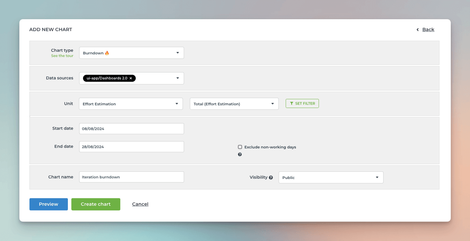
You can select any of your numeric custom fields as the unit. In this example, Effort estimation is chosen as the unit.
The work scope is set with a filter. Pick the iteration you want to include in the filter settings.
If you check exclude non-working days, the expected burndown will be flat during the weekends.
When you click Create chart, the chart is created, and you can find it under the Charts tab at the top navigation.
Here’s an example chart:
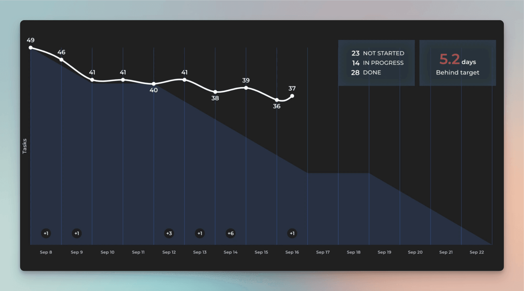
The lighter-colored area in the background shows the expected burndown. That’s how your burndown would look if you completed the work evenly throughout the iteration. The white line is your actual burndown. The expected burndown guides you so that if your actual burndown differs from the expected burndown, you know you are behind or ahead of the iteration plan.
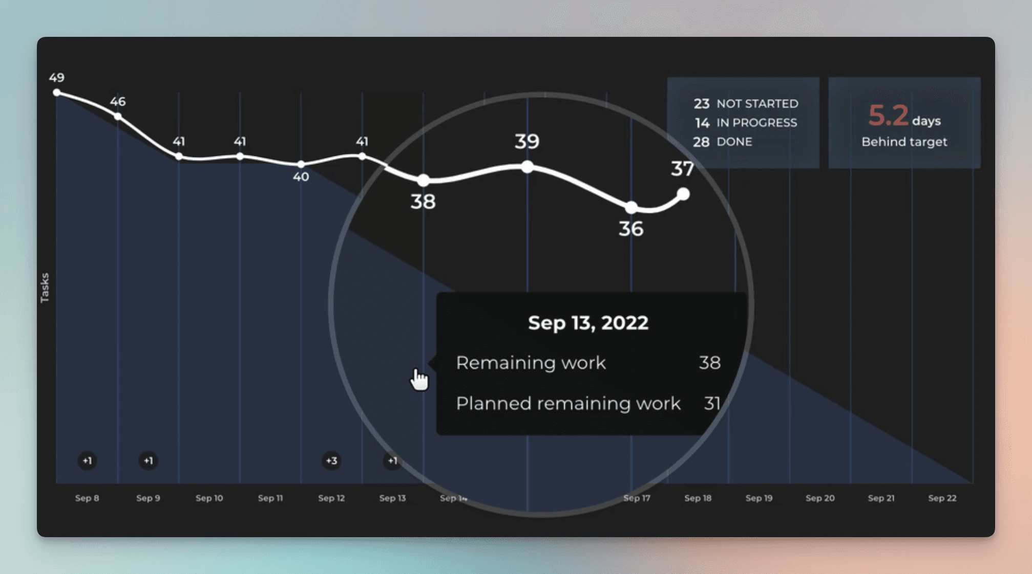
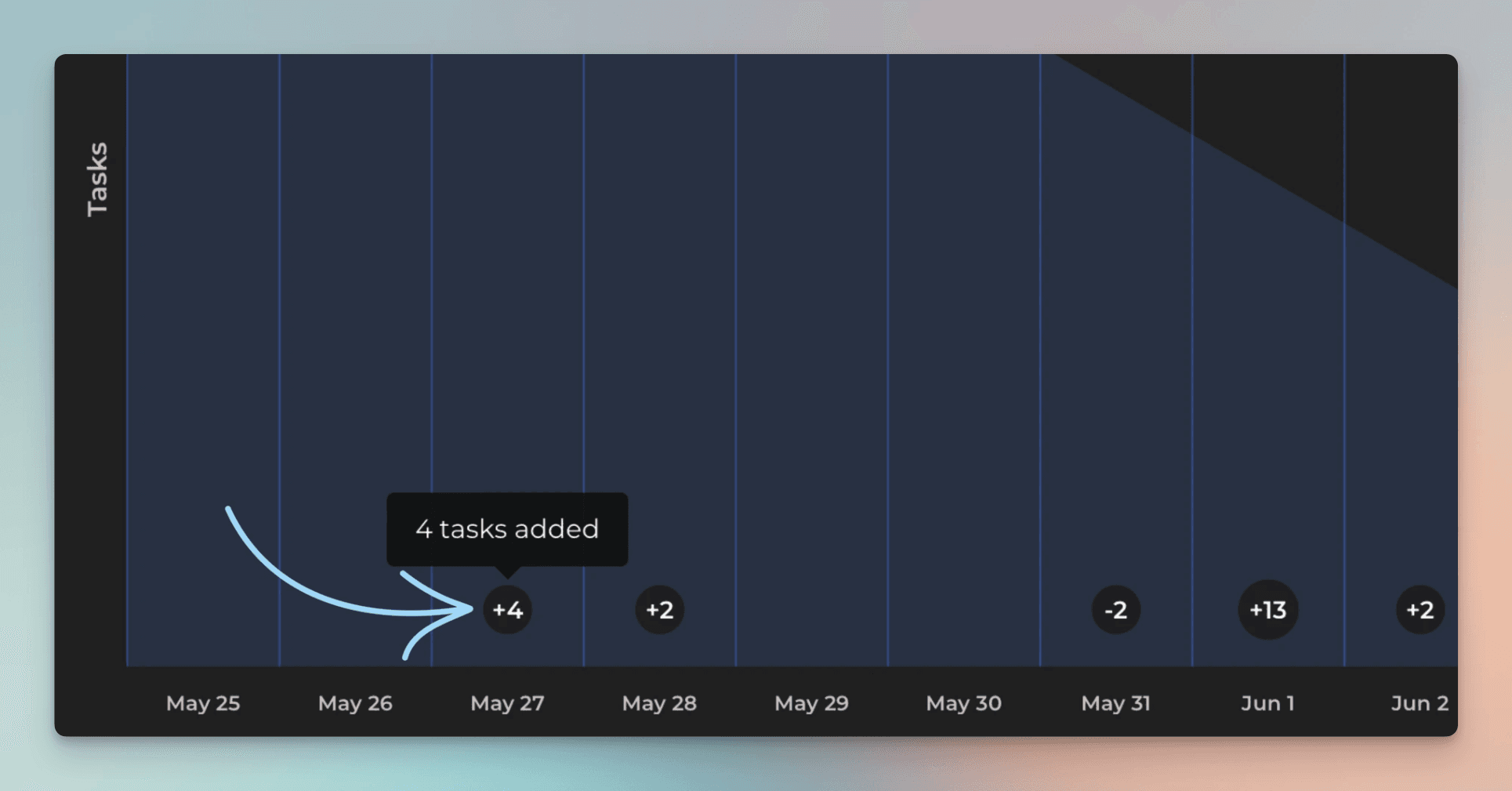
If work is added or removed during the iteration, it is shown as small circles in the timeline:
Good luck with meeting your sprint goal!
As with any of our custom charts, you can assign it to a report and share it via scheduled emails or share links.
Creating charts using Text fields
All your GitHub Projects Text fields are automatically imported and made available for charts. By default, they are mapped in Screenful to Text type, which means they can only be used as a column in a Task list. If you want to use your text fields for grouping and filtering, you can change the default mapping at Data Mapping->Custom Fields:

In this example, the Text field Hours Estimation is mapped to Text. Clicking the row opens it for editing:

Selecting Group & Filter from the menu enables using the field for grouping and filtering.
To get started, see the guide for setting up Screenful with GitHub.
Let us know if you have questions or feedback by contacting hello@screenful.com. To stay on the loop, read our blog, or follow us on LinkedIn.
