How to see all your Asana workload in a single chart?
How to see all your Asana workload in a single chart?
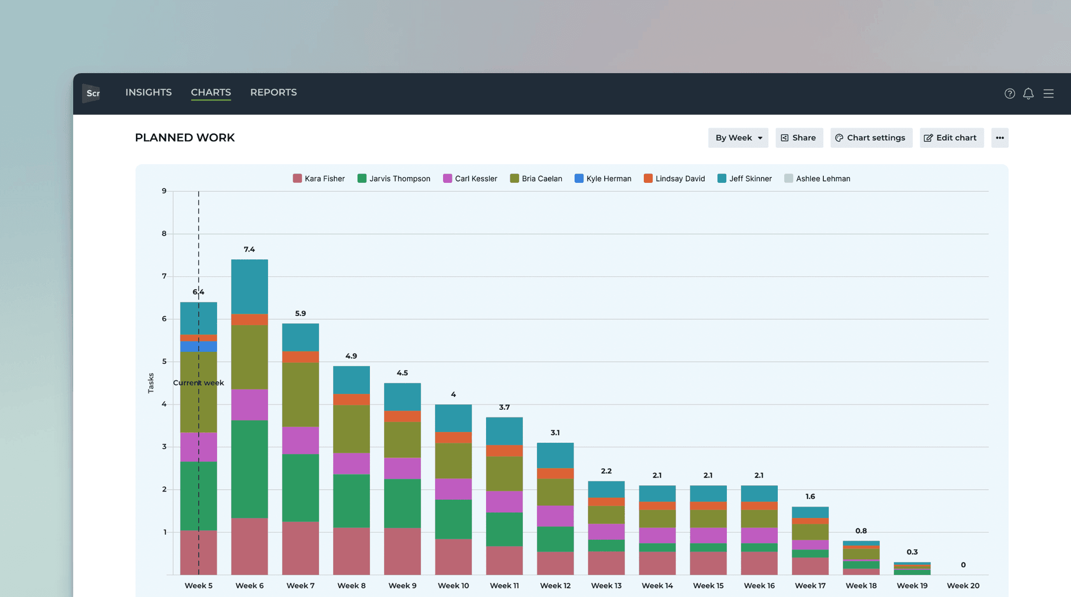
The Planned work chart shows how much work is planned for the future. It takes all the tasks with a set due date and shows a summary per day/week/month/quarter of the total planned work.
Here’s an example chart:

In this example, the chart is grouped by Week and the bar segment is Assignee. The chart shows how much work is allocated per week for each assignee. The leftmost bar is the current week. The bars to the right are the future weeks.
The chart shows the work with planned duration. That means a task must have at least a due date set to be included in this chart. Tasks without any deadlines are not included in this chart.
The Planned work chart shows how much work is planned for the future. It takes all the tasks with a set due date and shows a summary per day/week/month/quarter of the total planned work.
Here’s an example chart:
In this example, the chart is grouped by Week and the bar segment is Assignee. The chart shows how much work is allocated per week for each assignee. The leftmost bar is the current week. The bars to the right are the future weeks.
The chart shows the work with planned duration. That means a task must have at least a due date set to be included in this chart. Tasks without any deadlines are not included in this chart.
Adding start and due dates to Asana tasks
To add a start date and a due date:
Click on the Due Date field within the task.
Click on or type in the due date.
Click on or type in your desired start date to the left of the due date.

Once you have added start or due dates for your tasks, Screenful reads them and lets you create task lists and charts based on those dates.
You can also use any of your custom Date fields to represent the start dates or due dates. Learn how to configure any custom date field as start or due date for tasks.
When you adjust the data in your board, the changes will be reflected in the chart after the next data sync, which runs automatically once per hour. You can trigger the sync manually from the main menu.
Adding start and due dates to Asana tasks
To add a start date and a due date:
Click on the Due Date field within the task.
Click on or type in the due date.
Click on or type in your desired start date to the left of the due date.
Once you have added start or due dates for your tasks, Screenful reads them and lets you create task lists and charts based on those dates.
You can also use any of your custom Date fields to represent the start dates or due dates. Learn how to configure any custom date field as start or due date for tasks.
When you adjust the data in your board, the changes will be reflected in the chart after the next data sync, which runs automatically once per hour. You can trigger the sync manually from the main menu.
Allocate all work to the due date or evenly between start and end
There are two options for allocating the work. Either it is fully allocated to the due date, or the work is allocated evenly between the start and due date. You can choose between these in the chart settings:

If you have selected Allocate all work to the end date, all work will be contributed to the single date, the close date. With this selection, you don't need start dates at all.
If you select Allocate work evenly between start and end date, work is contributed evenly between the start and the end date.
For example, if you have an item with an estimated effort of 20 story points, and there are 10 days between the start date and the due date, two story points will be allocated for each day. If the start date is not set, the work is allocated from the current date until the due date.
Allocate all work to the due date or evenly between start and end
There are two options for allocating the work. Either it is fully allocated to the due date, or the work is allocated evenly between the start and due date. You can choose between these in the chart settings:
If you have selected Allocate all work to the end date, all work will be contributed to the single date, the close date. With this selection, you don't need start dates at all.
If you select Allocate work evenly between start and end date, work is contributed evenly between the start and the end date.
For example, if you have an item with an estimated effort of 20 story points, and there are 10 days between the start date and the due date, two story points will be allocated for each day. If the start date is not set, the work is allocated from the current date until the due date.
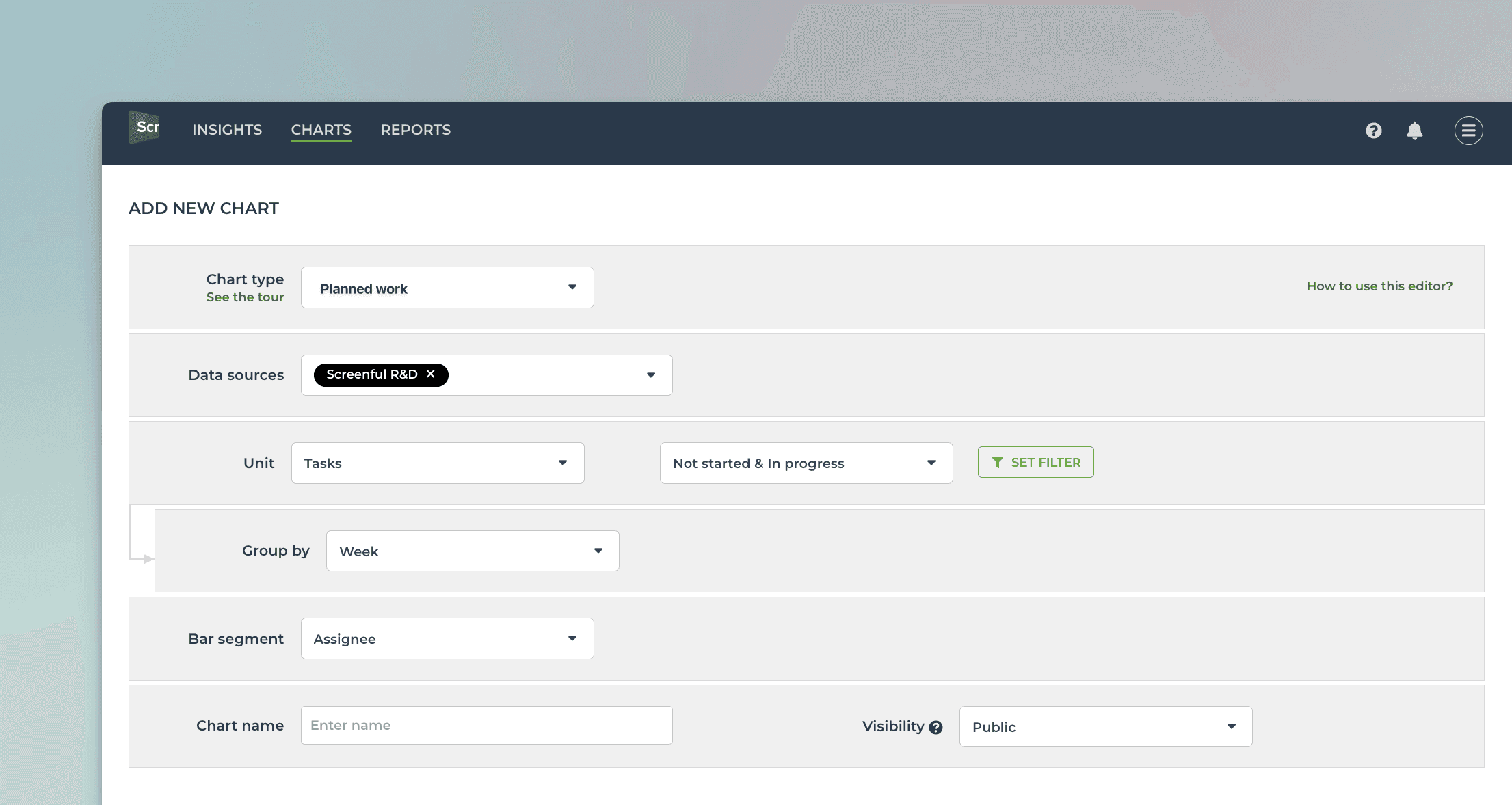
Creating the Planned Work chart
To create a Planned Work chart, go to the Charts tab and click Add new chart.
A modal is opened with a set of chart templates. Select New blank chart to open the chart editor. Select Planned work as the chart type. In this example, we’ve selected grouping to be by Week, and bar segment to be Assignee.
That produces the chart seen at the beginning of this guide:
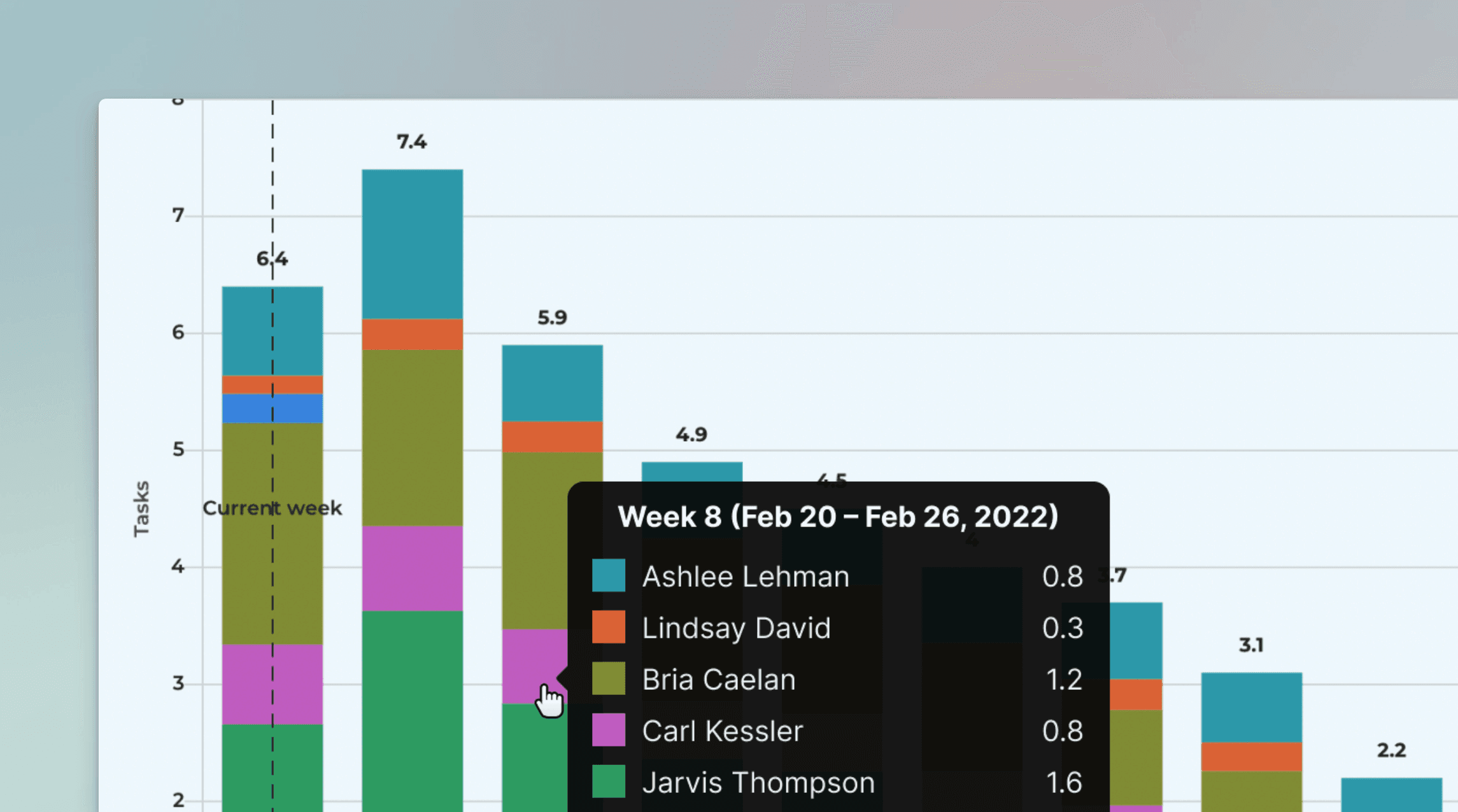
You can mouse-hover the bars to see the work allocated for each indvidual for each week:
Once you've created the chart, you can place it in a report and schedule it to be sent via email or Slack.
Creating the Planned Work chart
To create a Planned Work chart, go to the Charts tab and click Add new chart.
A modal is opened with a set of chart templates. Select New blank chart to open the chart editor. Select Planned work as the chart type. In this example, we’ve selected grouping to be by Week, and bar segment to be Assignee.
That produces the chart seen at the beginning of this guide:
You can mouse-hover the bars to see the work allocated for each indvidual for each week:
Once you've created the chart, you can place it in a report and schedule it to be sent via email or Slack.
About Screenful
Screenful provides multidimensional analytics of the data in Asana. You can slice & dice your data with 15 different chart types, and click-through to drill into details.
Analytics & Reports by Screenful is available on Asana Apps and Integrations.
About Screenful
Screenful provides multidimensional analytics of the data in Asana. You can slice & dice your data with 15 different chart types, and click-through to drill into details.
Analytics & Reports by Screenful is available on Asana Apps and Integrations.
Learn more
Learn more
FAQ
Common questions
Screenful provides configurable charts and reports for Asana data, and tools to share that information with all stakeholders. Learn more about the supported metrics.
Screenful provides configurable charts and reports for Asana data, and tools to share that information with all stakeholders. Learn more about the supported metrics.
One data source is one Asana project. The pricing is based on the number of Asana projects you explicitly import to Screenful, not the total number of projects in Asana. You can compare plans on the pricing page.
You can import data sources from all the tools we support in the same Screenful account. Learn more about managing data sources.
The timings are based on your workflow settings. You can learn more from the Lead Time FAQ.
The timings are based on your workflow settings. You can learn more from the Lead Time FAQ.
Yes, you can use the formula field as a unit in the charts. All formula fields are automatically imported. However, to make them available as a unit, you must ensure that the field is mapped to a unit in the custom fields mapping. Once it is mapped, it will be available in the unit menus. You can learn more from this guide.
Yes, you can use the formula field as a unit in the charts. All formula fields are automatically imported. However, to make them available as a unit, you must ensure that the field is mapped to a unit in the custom fields mapping. Once it is mapped, it will be available in the unit menus. You can learn more from this guide.
Yes, you can filter charts based on due dates or by status such as overdue. You can also track the work planned for the future using the Planned work chart. Learn more about setting up the chart for Asana.
Yes, you can filter charts based on due dates or by status such as overdue. You can also track the work planned for the future using the Planned work chart. Learn more about setting up the chart for Asana.
Yes. You can use a custom field for entering an estimate to a task. Learn more about how to set estimates for your tasks in Asana.
Yes. You can use a custom field for entering an estimate to a task. Learn more about how to set estimates for your tasks in Asana.
Archived tasks are treated differently depending on whether they are completed or not. Completed tasks are still considered completed even if they are archived. Tasks that are archived before they were completed are considered removed.
Archived tasks are treated differently depending on whether they are completed or not. Completed tasks are still considered completed even if they are archived. Tasks that are archived before they were completed are considered removed.
You can manage the subscription in the billing settings. The location of the billing settings depends on the product you are subscribed to. You can learn more by following the instructions in this guide.
You can manage the subscription in the billing settings. The location of the billing settings depends on the product you are subscribed to. You can learn more by following the instructions in this guide.
We do not make changes to your data. We only read it via the API of your tool. Screenful is only for reporting and analytics. It does not update any data within your tools.
We do not make changes to your data. We only read it via the API of your tool. Screenful is only for reporting and analytics. It does not update any data within your tools.
All data sources are synced automatically once per hour. Changing settings or configuration will trigger additional sync so your data is at most one hour old. You can sync data manually at any time in the sync settings.
All data sources are synced automatically once per hour. Changing settings or configuration will trigger additional sync so your data is at most one hour old. You can sync data manually at any time in the sync settings.
Yes, you can create charts with a prompt and ask questions about a chart by using the Screenful AI Assistant. The assistant combines the leading LLMs with advanced multidimensional data analytics to help you understand and interpret your data.
Yes, you can create charts with a prompt and ask questions about a chart by using the Screenful AI Assistant. The assistant combines the leading LLMs with advanced multidimensional data analytics to help you understand and interpret your data.
What is the difference between these metrics?
Reaction time = time before the work was started
Cycle time = time from start to completion
Lead time = Reaction time + Cycle time
Timing metrics explained: Lead time vs Cycle time
How is the reaction time calculated?
Reaction time starts running when a task is moved into a state that is mapped to the "Not started" in the workflow mapping. The reaction time stops when the task is moved out from that state. If the task is never placed into a state that is mapped to the “Not started” workflow state, then the reaction time is zero.
What if tasks skip lists/columns, or there is no sequential workflow?
The timing information is based on how long items stay in the workflow states that are mapped to "In progress" in the workflow mapping. There is no need for sequential progress, and it is totally fine if tasks skip some of the workflow steps.
What if a task is moved from the “not started” state directly to “done” without going through any of the “in progress” states?
In that case, the cycle time will be zero.
How does the cycle time work if a task is moved into "in progress" and then back to "not started yet"? Similarly, what happens if a card is archived while it's in progress?
Cycle time is calculated only for completed tasks, so in both of those cases, cycle time would be undefined.
If a task is moved from "in progress" to "done", but then back to "in progress" again for additional work would this time be added to the cycle time?
Cycle time is counted only when the task is in progress, so the time spent in the "done" state is not included in the calculation.
When is a task created? Does the clock start when a task is created or when it is put in the "next" state (or equivalent)?
The clock starts when a task is moved to a workflow state that is mapped to the "not started" or "in progress" workflow state.
Are weekends included in the cycle time calculations?
Weekends are included in the calculations by default, but you can change that in the chart settings by selecting 'Exclude non-business hours. See How to set weekend days and office hours
By default yes, but you can specify your working hours and days in the Account Settings.
By default yes, but you can specify your working hours and days in the Account Settings.
Yes, there are a few different ways you can filter out outliers from the charts, including
Filtering by item name
Filtering by how long an item has been in progress
Setting a label and filtering out based on that label
You can learn more from this guide: How to remove outliers from data?
Yes, there are a few different ways you can filter out outliers from the charts, including
Filtering by item name
Filtering by how long an item has been in progress
Setting a label and filtering out based on that label
You can learn more from this guide: How to remove outliers from data?
Does this support my specific workflow or do I have to use some specific states like "open", "in progress" and "done"?
You are not limited to any specific set of states or a workflow. You can configure your own workflow, if such exists, and you can use that in your reporting. It's also ok if you don't have any workflow in your boards, as can create reports based on any other criteria by setting a filter.
You are not limited to any specific set of states or a workflow. You can configure your own workflow, if such exists, and you can use that in your reporting. It's also ok if you don't have any workflow in your boards, as can create reports based on any other criteria by setting a filter.
You can embed any custom chart or report to any web page using the embed code. Learn more about the sharing feature from the online guide.
You can embed any custom chart or report to any web page using the embed code. Learn more about the sharing feature from the online guide.
The Getting Started Guide contains Instructions for setting up Screenful.
See also our Accounts & Pricing FAQ.
Check out our knowledge base and video tutorials, or get in touch by emailing support@screenful.com
The Getting Started Guide contains Instructions for setting up Screenful.
See also our Accounts & Pricing FAQ.
Check out our knowledge base and video tutorials, or get in touch by emailing support@screenful.com
Troubleshooting
Below are some typical reasons for charts not displaying the data you expect:
Your data hasn't loaded yet. When the data sync process is in progress, a spinner icon is displayed at the top right of the UI. When you hover the mouse over the icon, you can see the progress.
The chart shows data based on a different field than what you think. Learn more about selecting items for a chart.
Your workflow mapping is not done correctly. You can learn more about workflow mapping from this guide. Notice that the cards that are in lists mapped to Excluded won't be imported to Screenful.
Your board is not connected. If a data source is not connected, you'll see a red notification on the top right of the UI. Click the notification icon to re-authorize the data source.
I have created an automation to move completed tasks from one Asana board to another. Will that mess up my stats?
If a task is moved from Project A to Project B, you will lose the task history from Project A since the Asana API won't return it anymore. Instead of moving to another project, you can create a dedicated "Archived" section at the bottom of your project (that is folded by default), and set up an automation to move completed tasks to that section instead of another project. That way, you won't lose any history.
If a task is moved from Project A to Project B, you will lose the task history from Project A since the Asana API won't return it anymore. Instead of moving to another project, you can create a dedicated "Archived" section at the bottom of your project (that is folded by default), and set up an automation to move completed tasks to that section instead of another project. That way, you won't lose any history.
When you are importing projects, you are shown all the projects of the teams in which you are a member. In order to see more projects, add yourself to the respective teams.
When you are importing projects, you are shown all the projects of the teams in which you are a member. In order to see more projects, add yourself to the respective teams.
You may not see all the portfolios due to a restriction in the Asana API. Portfolios are shown only if the user who did the authorization is the owner of the portfolios.
You may not see all the portfolios due to a restriction in the Asana API. Portfolios are shown only if the user who did the authorization is the owner of the portfolios.
While both the public and private channels are shown in the menu, you won’t receive the report to a private channel without explicitly adding the Screenful app to that channel. Learn how to enable sending to a private Slack channel.
There can also be restrictions on who can install apps to your Slack. Learn how to manage app approval in your Slack workspace.
Some browser plugins may interfere with the authorization process. If you see an empty page during the authorization or the list of channels is empty, you should try with another browser (or ask your colleague to do the Slack authorization).
Filter options are derived from task data, which means that if you recently added some properties, such as labels, but haven't yet assigned them to any tasks, they won't show up in the filter options. As soon as you assign them to tasks, they will show up in the filter options from then on.
Filter options are derived from task data, which means that if you recently added some properties, such as labels, but haven't yet assigned them to any tasks, they won't show up in the filter options. As soon as you assign them to tasks, they will show up in the filter options from then on.
If you or your colleague didn't receive the user invitation email, you can go to the user settings and click the Copy invitation link button to copy the link to the clipboard. After that, you can share the link via any channel (email, Slack, Teams, etc). You can learn more from the user invitation guide.
If you or your colleague didn't receive the user invitation email, you can go to the user settings and click the Copy invitation link button to copy the link to the clipboard. After that, you can share the link via any channel (email, Slack, Teams, etc). You can learn more from the user invitation guide.
Troubleshooting
Below are some typical reasons for charts not displaying the data you expect:
Your data hasn't loaded yet. When the data sync process is in progress, a spinner icon is displayed at the top right of the UI. When you hover the mouse over the icon, you can see the progress.
The chart shows data based on a different field than what you think. Learn more about selecting items for a chart.
Your workflow mapping is not done correctly. You can learn more about workflow mapping from this guide. Notice that the cards that are in lists mapped to Excluded won't be imported to Screenful.
Your board is not connected. If a data source is not connected, you'll see a red notification on the top right of the UI. Click the notification icon to re-authorize the data source.
I have created an automation to move completed tasks from one Asana board to another. Will that mess up my stats?
If a task is moved from Project A to Project B, you will lose the task history from Project A since the Asana API won't return it anymore. Instead of moving to another project, you can create a dedicated "Archived" section at the bottom of your project (that is folded by default), and set up an automation to move completed tasks to that section instead of another project. That way, you won't lose any history.
If a task is moved from Project A to Project B, you will lose the task history from Project A since the Asana API won't return it anymore. Instead of moving to another project, you can create a dedicated "Archived" section at the bottom of your project (that is folded by default), and set up an automation to move completed tasks to that section instead of another project. That way, you won't lose any history.
When you are importing projects, you are shown all the projects of the teams in which you are a member. In order to see more projects, add yourself to the respective teams.
When you are importing projects, you are shown all the projects of the teams in which you are a member. In order to see more projects, add yourself to the respective teams.
You may not see all the portfolios due to a restriction in the Asana API. Portfolios are shown only if the user who did the authorization is the owner of the portfolios.
You may not see all the portfolios due to a restriction in the Asana API. Portfolios are shown only if the user who did the authorization is the owner of the portfolios.
While both the public and private channels are shown in the menu, you won’t receive the report to a private channel without explicitly adding the Screenful app to that channel. Learn how to enable sending to a private Slack channel.
There can also be restrictions on who can install apps to your Slack. Learn how to manage app approval in your Slack workspace.
Some browser plugins may interfere with the authorization process. If you see an empty page during the authorization or the list of channels is empty, you should try with another browser (or ask your colleague to do the Slack authorization).
While both the public and private channels are shown in the menu, you won’t receive the report to a private channel without explicitly adding the Screenful app to that channel. Learn how to enable sending to a private Slack channel.
There can also be restrictions on who can install apps to your Slack. Learn how to manage app approval in your Slack workspace.
Some browser plugins may interfere with the authorization process. If you see an empty page during the authorization or the list of channels is empty, you should try with another browser (or ask your colleague to do the Slack authorization).
Filter options are derived from task data, which means that if you recently added some properties, such as labels, but haven't yet assigned them to any tasks, they won't show up in the filter options. As soon as you assign them to tasks, they will show up in the filter options from then on.
Filter options are derived from task data, which means that if you recently added some properties, such as labels, but haven't yet assigned them to any tasks, they won't show up in the filter options. As soon as you assign them to tasks, they will show up in the filter options from then on.
If you or your colleague didn't receive the user invitation email, you can go to the user settings and click the Copy invitation link button to copy the link to the clipboard. After that, you can share the link via any channel (email, Slack, Teams, etc). You can learn more from the user invitation guide.
If you or your colleague didn't receive the user invitation email, you can go to the user settings and click the Copy invitation link button to copy the link to the clipboard. After that, you can share the link via any channel (email, Slack, Teams, etc). You can learn more from the user invitation guide.