The custom charts feature allows you to create charts from one or more data sources. You can choose from 15 chart types and configure them to suit your needs.
This guide shows you three different ways to create custom charts in Screenful using data from Jira, Trello, Linear, GitHub, GitLab, monday.com, and Asana..
Create a chart from a template
To create a custom chart from a template, go to the Charts tab and click Add new chart in the top right corner.
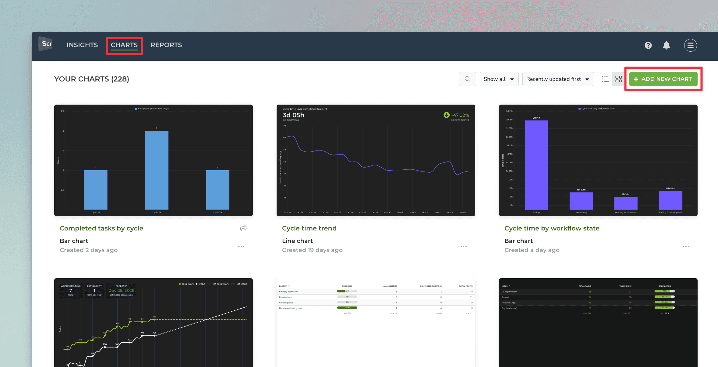
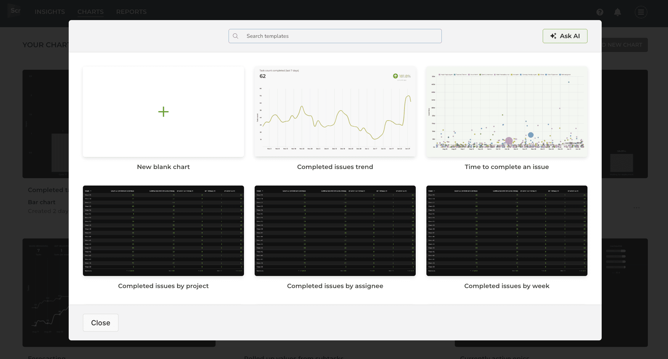
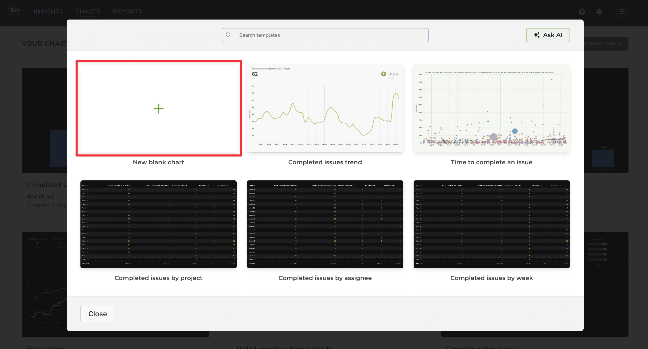
A modal is opened with a set of chart templates. You can either create a new chart from scratch or pick one of the predefined charts.
Clicking a chart template opens a preview with real data. You can select the data sources from the Data sources menu above the chart. You can pick one or more data sources for your chart and see the results immediately.
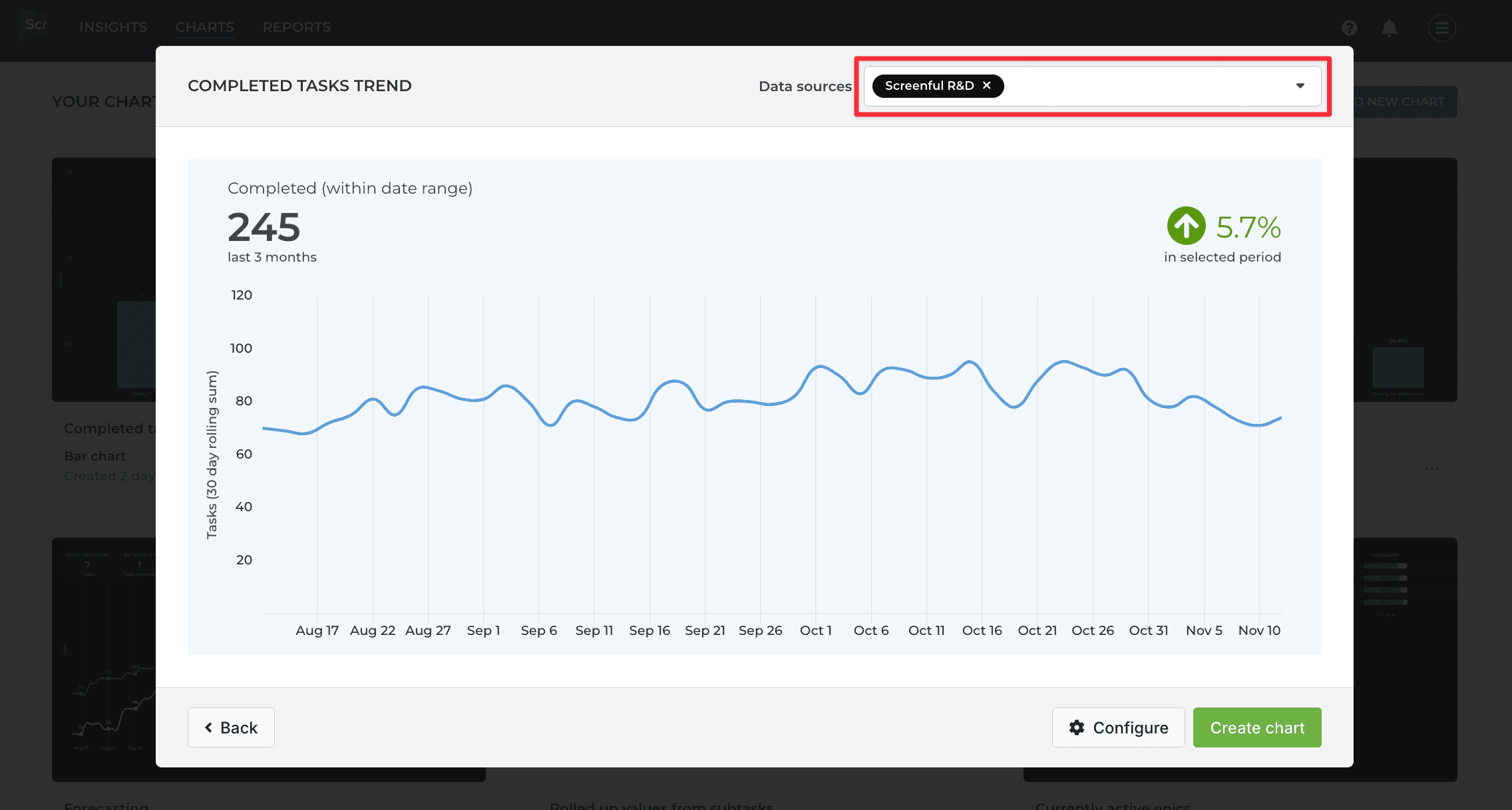
The template comes with predefined settings. If you're happy with the chart, you can click Create chart to save it under the Charts tab.
To adjust the settings, click Configure to open the chart for editing.
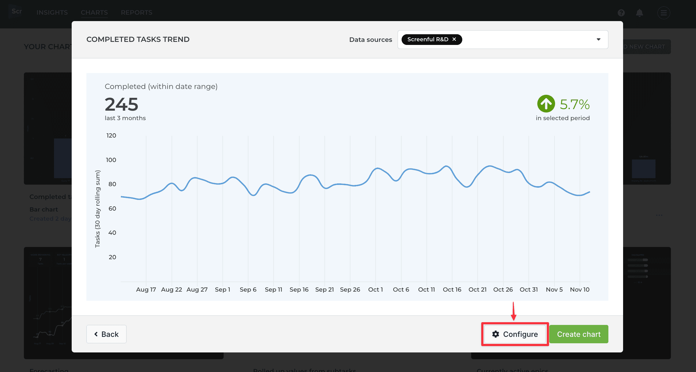
The chart editor opens, revealing the chart settings. If the chart is anywhere close to what you’re looking for, you should be able to make it perfect with just a few adjustments.
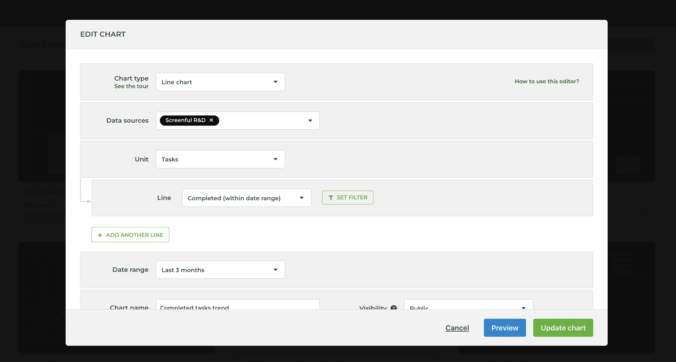
You can adjust the name, unit, metrics, date range, and set filters.
When you click Create chart, the chart is created and you can find it under the Charts tab under the main navigation.
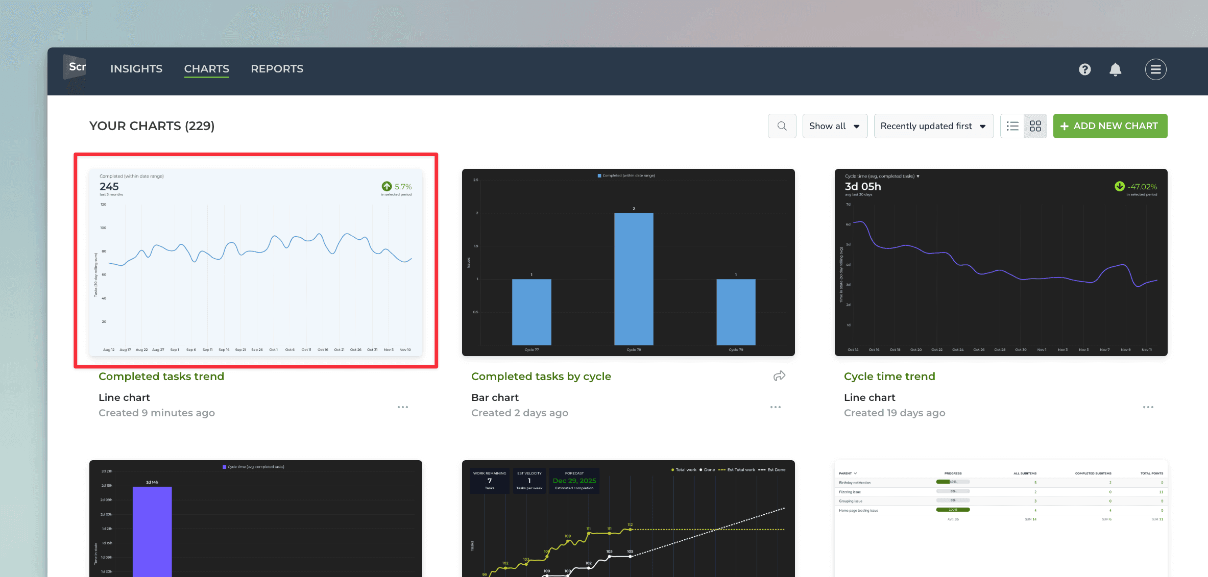
From there, you can assign it to a report or share it with others using the share links.
Create a chart with the editor
While chart templates can get you started quickly, the chart editor allows the flexibility to create the exact chart you're looking for. To create a custom chart using the chart editor, go to the Charts tab and click Add new chart in the top right corner.
In the modal, select New blank chart:
The chart editor opens, allowing you to select the chart type and the settings for the chart:
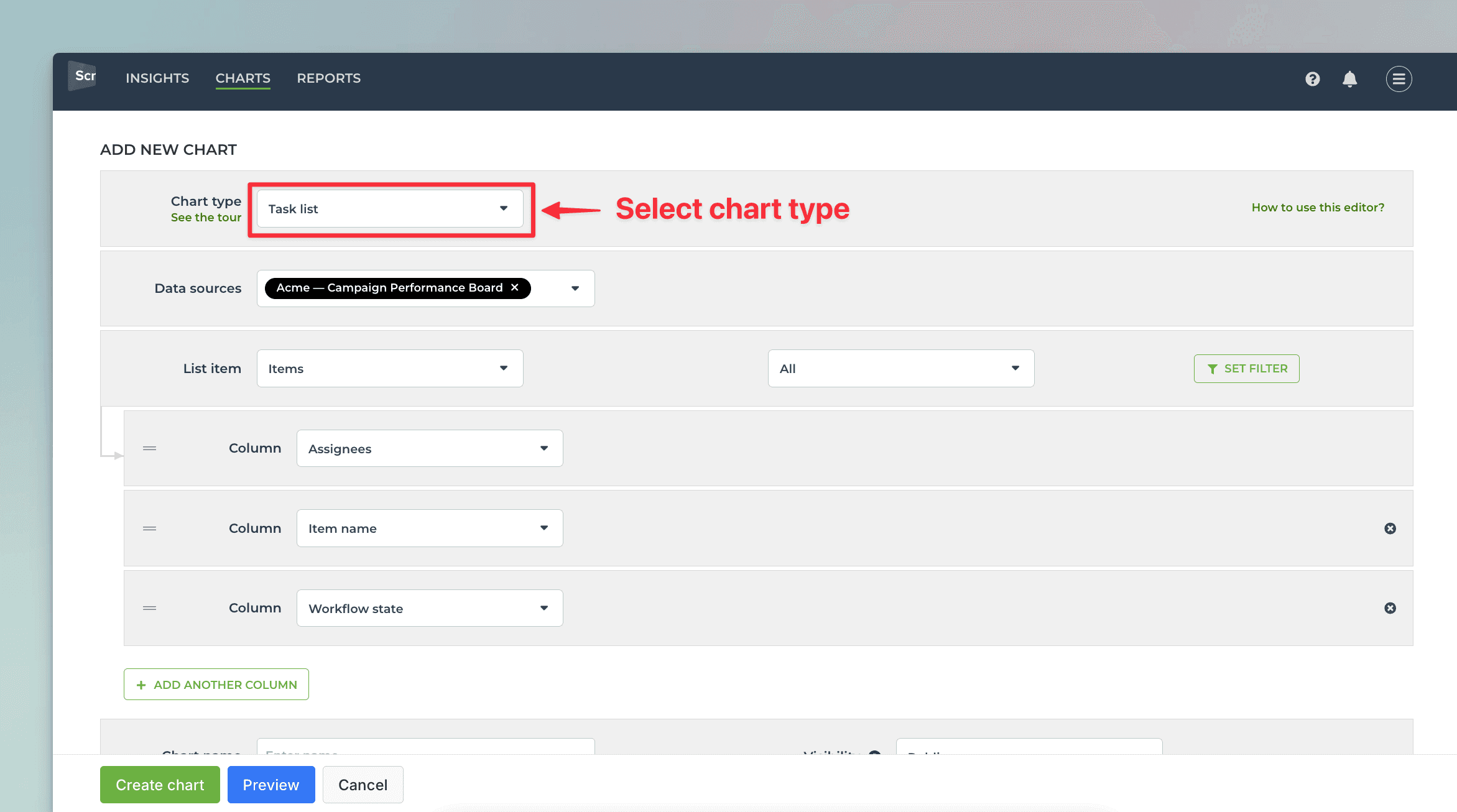
The settings depend on the selected chart type. You can adjust the settings and use the Preview feature to see the result.
Once you are happy with the result, you can click Create chart to save the chart under the Charts tab.
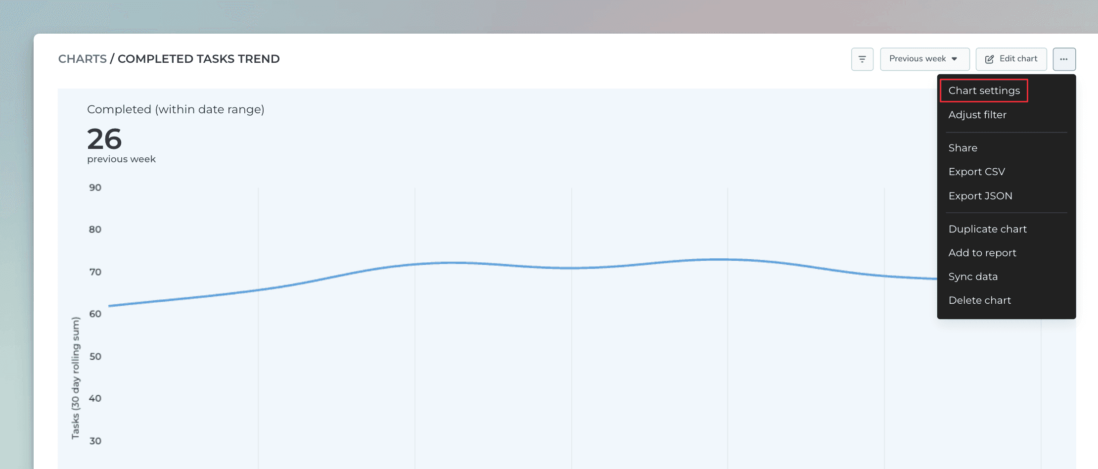
You can further customize the chart by selecting the Chart settings from the three dots menu:
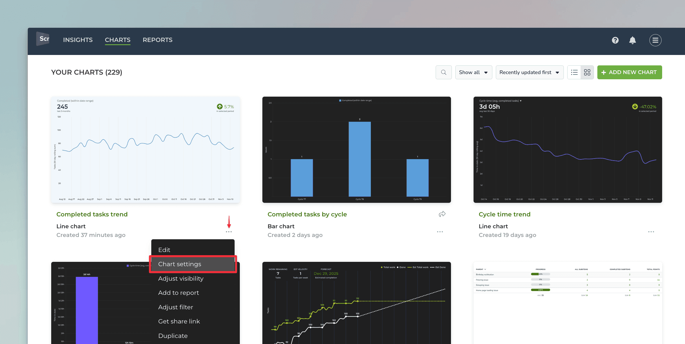
In the Chart settings, you can rename labels, set visibility, quick filters, and many other things depending on the chart type.
Create a chart with the AI assistant
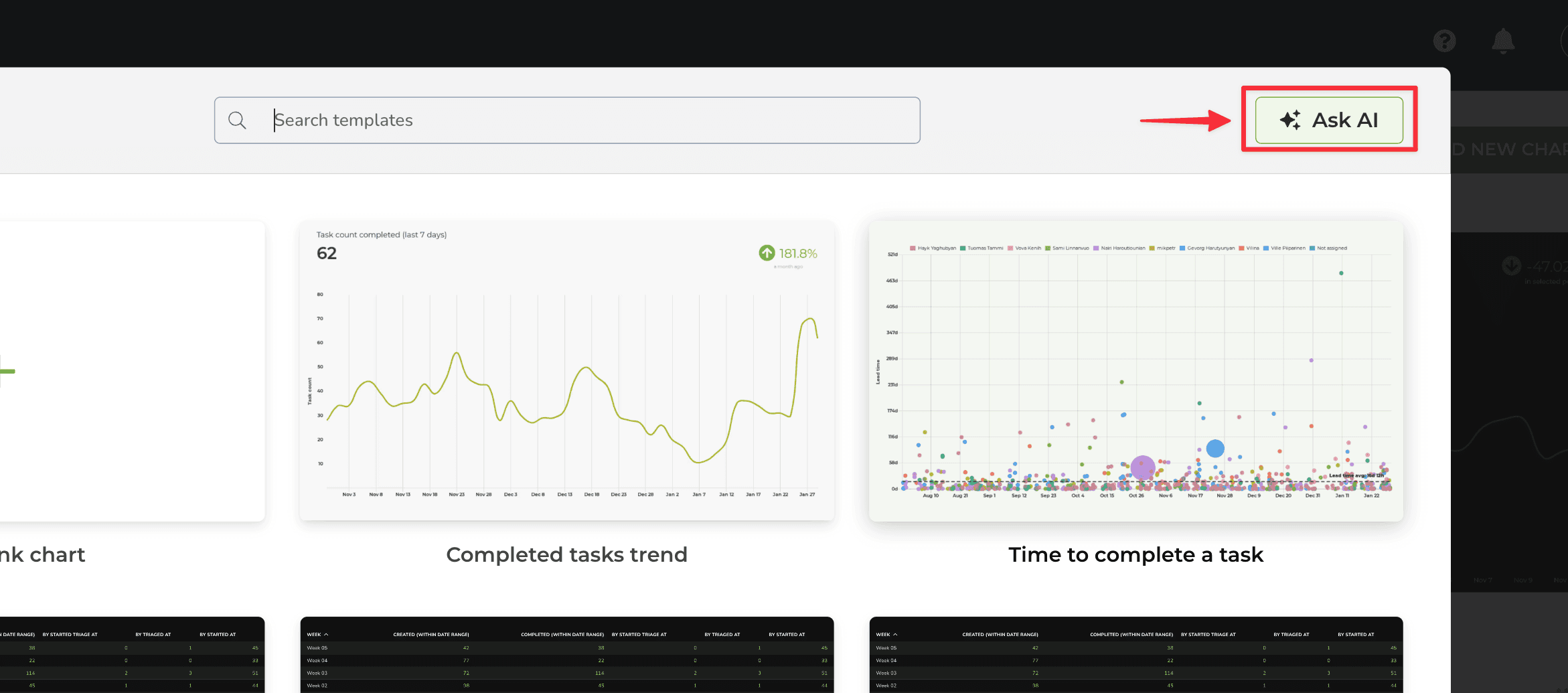
The AI assistant can be launched from the charts modal by clicking the Ask AI button on the top right corner:
A chat view opens, and you can start chatting with the assistant:
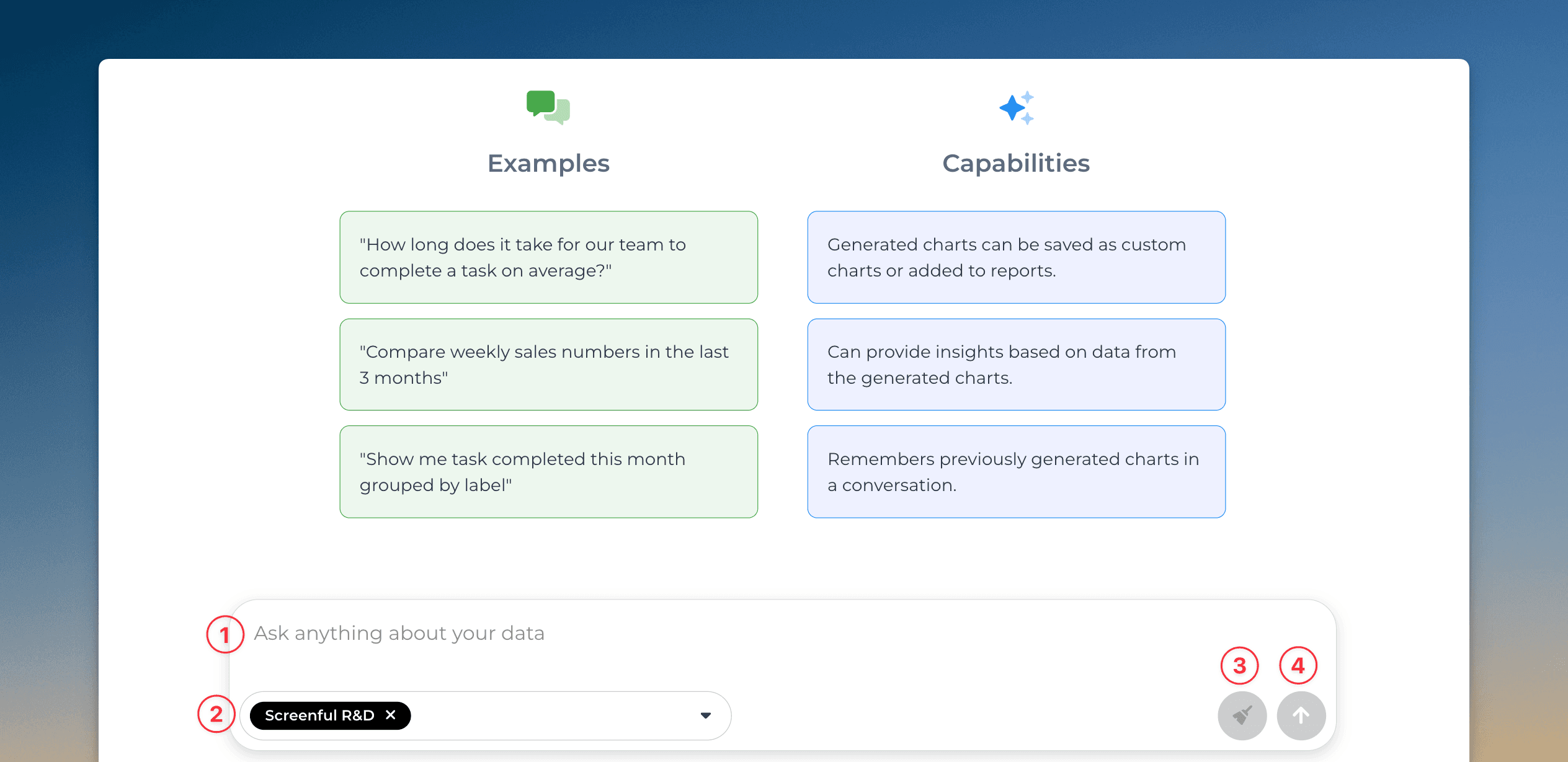
The numbered elements are:
Enter a prompt in a natural language (in English or your native language)
Select data sources from the drop-down menu.
Clear chat history. Removes chats and makes the assistant forget previous prompts.
Send message (same as pressing the enter key)
You can create a chart by describing it in natural language (any language). You can ask questions like
"Show me task completed this month grouped by label"
"Compare weekly sales numbers in the last 3 months"
"How long does it take for our team to complete a task on average?"
If the assistant understood your prompt, you should see a chart as a result. You can refine the chart with further asks:
"Switch the colors of the bars to blue and change the grouping to assignee"
The assistant adjusts the chart according to your request. You can always undo the latest change and try again with a different prompt.
At any time, you can open the chart for editing by clicking Edit below the chart. The chart editor is opened, and you can adjust the chart configuration.
Clicking Save below the chart saves it, and you can find it in the Charts tab.
Learn more
FAQ
Common questions
When installing the Marketplace add-on:
You get Screenful embedded within your JIRA UI (but you can also use it as a web app)
Any user in your Jira instance can join the Screenful account without an invitation
You will be billed by Atlassian instead of Screenful
The pricing is according to the number of users in your Jira instance
There is no single-sign-on option
When deploying as a SaaS service via the Screenful website:
You use Screenful as a standalone web app, not embedded within the Jira UI
Each user must be invited to log in to Screenful (you can choose who gets access)
You will be billed by Screenful instead of Atlassian. Prices are according to the pricing page.
Single-sign-on is available as an add-on in every plan
You can learn more about the deployment options from this article.
A data source is a Jira board. The pricing is based on the number of boards you explicitly import to Screenful, not the total number of boards in your Jira instance. You can compare plans on the pricing page.
You can import data sources from all the tools we support in the same Screenful account. Learn more about managing data sources.
Yes as long as there’s a Jira Software instance available in addition to the Jira Service Management. Here’s a step-by-step guide for importing Jira Service Management projects.
Yes as long as there’s a Jira Software instance available in addition to the Jira Service Management. Here’s a step-by-step guide for importing Jira Service Management projects.
Yes as long as there’s a Jira Software instance available in addition to the Jira Work Management. Here’s a step-by-step guide for importing Jira Work Management projects.
Yes as long as there’s a Jira Software instance available in addition to the Jira Work Management. Here’s a step-by-step guide for importing Jira Work Management projects.
Yes as long as there’s a Jira Software instance available in addition to the Jira Product Discovery. Here’s a step-by-step guide for importing Jira Product Discovery projects.
Yes as long as there’s a Jira Software instance available in addition to the Jira Product Discovery. Here’s a step-by-step guide for importing Jira Product Discovery projects.
With Screenful, you can get reports of the current sprint or any of your previous sprints in Jira. You can aggregate sprint data across multiple boards into one chart. You can learn more from this guide for tracking Jira sprints.
With Screenful, you can get reports of the current sprint or any of your previous sprints in Jira. You can aggregate sprint data across multiple boards into one chart. You can learn more from this guide for tracking Jira sprints.
You can invite colleagues by sending them an invitation.
If you have installed Screenful via the Atlassian Marketplace, your colleagues can join by simply clicking on the Screenful app link within the Jira UI (see the “Apps” menu on the top navigation). They will be prompted to signup after which they will join the account created by you. Initially they have “Member” status and can access all the Screenful features. You can change their status in the Account settings.
Is access to imported Jira data controlled only by Screenful or does my Jira permissions also affect what I can see inside Screenful?
Jira permissions only affect your ability to create data sources. You can create data sources only from the boards you have access to in Jira.
Screenful visibility settings define which charts and reports you’re able to view within Screenful.
Jira permissions only affect your ability to create data sources. You can create data sources only from the boards you have access to in Jira.
Screenful visibility settings define which charts and reports you’re able to view within Screenful.
Yes, you can filter charts based on due dates or by status such as overdue. You can also track the amount of work planned for the future using the Planned work chart. Learn more about setting up the chart for Jira.
Yes, you can filter charts based on due dates or by status such as overdue. You can also track the amount of work planned for the future using the Planned work chart. Learn more about setting up the chart for Jira.
The timings are based on your workflow settings. You can learn more from the Lead Time FAQ.
The timings are based on your workflow settings. You can learn more from the Lead Time FAQ.
If you have installed Screenful via the Atlassian Marketplace, others will also see the Screenful link in the Jira UI, and when they click it, they are shown the signup form. So you don't have to send invitation emails in order to invite colleagues, although you can do that as well. When they fill out the form, they will be added to your Screenful account. You can adjust their role and permissions at Account-->Manage Users.
If you have installed Screenful via the Atlassian Marketplace, others will also see the Screenful link in the Jira UI, and when they click it, they are shown the signup form. So you don't have to send invitation emails in order to invite colleagues, although you can do that as well. When they fill out the form, they will be added to your Screenful account. You can adjust their role and permissions at Account-->Manage Users.
Screenful stores data outside Jira so a mechanism for authentication and authorisation is needed. Screenful can always be used in stand-alone mode, just browse to app.screenful.me and log in with your Screenful credentials.
Screenful stores data outside Jira so a mechanism for authentication and authorisation is needed. Screenful can always be used in stand-alone mode, just browse to app.screenful.me and log in with your Screenful credentials.
By default, charts and reports are public. You can set them to private in the settings (behind the three dots menu).
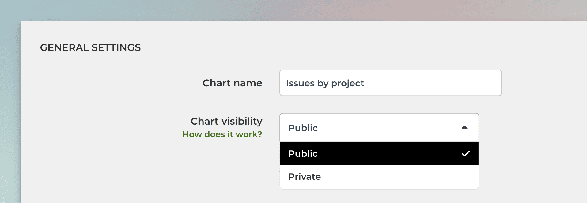
Here's what these settings mean:
If a chart is set to public, it appears in the Charts tab for all users in your account. Anyone in the account can edit the chart or add it to a report.
If a chart is set to private, it appears only to you in the Charts tab. Other users in your account cannot view it. You can still add the chart to a report. When you do, the chart becomes visible to anyone who has access to that report.
If a report is set to public, it is visible under the Reports tab to all users in your account. Anyone in your account can edit or schedule that report.
If a report is set to private, it is visible only to you in the Reports tab. Other people in your account won’t be able to edit or schedule that report. You can still schedule the report to be sent via email or Slack, and when you do so, the recipients can see the PDF version of the report. However, they cannot access the online version of that report since it is private.
By default, charts and reports are public. You can set them to private in the settings (behind the three dots menu).
Here's what these settings mean:
If a chart is set to public, it appears in the Charts tab for all users in your account. Anyone in the account can edit the chart or add it to a report.
If a chart is set to private, it appears only to you in the Charts tab. Other users in your account cannot view it. You can still add the chart to a report. When you do, the chart becomes visible to anyone who has access to that report.
If a report is set to public, it is visible under the Reports tab to all users in your account. Anyone in your account can edit or schedule that report.
If a report is set to private, it is visible only to you in the Reports tab. Other people in your account won’t be able to edit or schedule that report. You can still schedule the report to be sent via email or Slack, and when you do so, the recipients can see the PDF version of the report. However, they cannot access the online version of that report since it is private.
The Screenful AI assistant helps you get answers to your questions. You can use a chat interface to
Ask questions about Screenful features
Create charts
Explain a chart
The AI assistant is available in all Screenful plans.
The Screenful AI assistant helps you get answers to your questions. You can use a chat interface to
Ask questions about Screenful features
Create charts
Explain a chart
The AI assistant is available in all Screenful plans.
What is the difference between these metrics?
Reaction time = time before the work was started
Cycle time = time from start to completion
Lead time = Reaction time + Cycle time
Timing metrics explained: Lead time vs Cycle time
How is the reaction time calculated?
Reaction time starts running when a task is moved into a state that is mapped to the "Not started" in the workflow mapping. The reaction time stops when the task is moved out from that state. If the task is never placed into a state that is mapped to the “Not started” workflow state, then the reaction time is zero.
What if tasks skip lists/columns, or there is no sequential workflow?
The timing information is based on how long items stay in the workflow states that are mapped to "In progress" in the workflow mapping. There is no need for sequential progress, and it is totally fine if tasks skip some of the workflow steps.
What if a task is moved from the “not started” state directly to “done” without going through any of the “in progress” states?
In that case, the cycle time will be zero.
How does the cycle time work if a task is moved into "in progress" and then back to "not started yet"? Similarly, what happens if a card is archived while it's in progress?
Cycle time is calculated only for completed tasks, so in both of those cases, cycle time would be undefined.
If a task is moved from "in progress" to "done", but then back to "in progress" again for additional work would this time be added to the cycle time?
Cycle time is counted only when the task is in progress, so the time spent in the "done" state is not included in the calculation.
When is a task created? Does the clock start when a task is created or when it is put in the "next" state (or equivalent)?
The clock starts when a task is moved to a workflow state that is mapped to the "not started" or "in progress" workflow state.
Are weekends included in the cycle time calculations?
Weekends are included in the calculations by default, but you can change that in the chart settings by selecting 'Exclude non-business hours. See How to set weekend days and office hours
Yes, you can configure summaries in Task lists and Table charts to display medians.
Yes, you can configure summaries in Task lists and Table charts to display medians.
When displaying data as a line chart, a sliding window is used to smooth away the daily fluctuations so that you can see the trend from the noise.
If you select 1 day rolling window, each point in the horizontal axis displays the number of items (e.g., tasks created or tasks completed) per day. With 7 day rolling window, each point in the horizontal axis displays the sum (or average, depending on what metrics were selected) over the previous seven-day period.
The rolling window size is configurable in the Chart settings. You can access the chart settings from the three dots menu:
In the chart settings, you can select between 1, 7, 30, or 90 rolling windows:
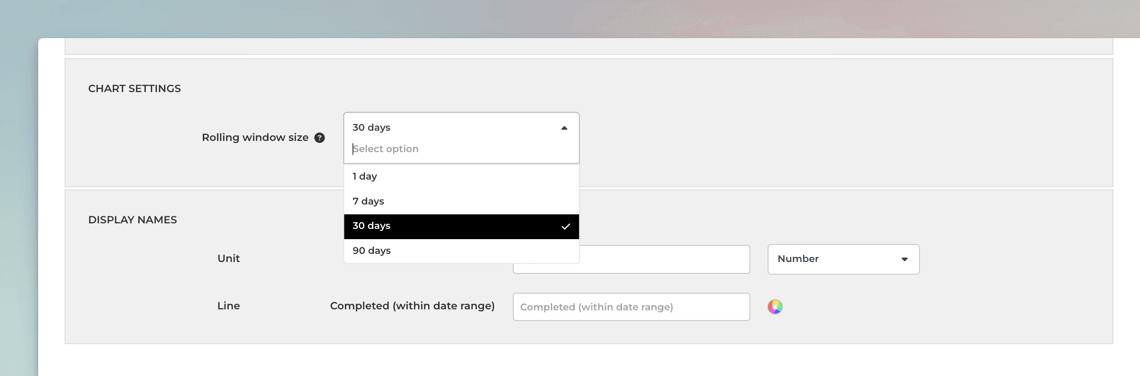
The longer the rolling window, the less variation there is in values, creating a smoother trend line. With smaller window sizes, you can see more details, but the overall trend may get distorted by the daily fluctuations.
When displaying data as a line chart, a sliding window is used to smooth away the daily fluctuations so that you can see the trend from the noise.
If you select 1 day rolling window, each point in the horizontal axis displays the number of items (e.g., tasks created or tasks completed) per day. With 7 day rolling window, each point in the horizontal axis displays the sum (or average, depending on what metrics were selected) over the previous seven-day period.
The rolling window size is configurable in the Chart settings. You can access the chart settings from the three dots menu:
In the chart settings, you can select between 1, 7, 30, or 90 rolling windows:
The longer the rolling window, the less variation there is in values, creating a smoother trend line. With smaller window sizes, you can see more details, but the overall trend may get distorted by the daily fluctuations.
Yes, you can create charts with a prompt and ask questions about a chart by using the Screenful AI Assistant. The assistant combines the leading LLMs with advanced multidimensional data analytics to help you understand and interpret your data.
Yes, you can create charts with a prompt and ask questions about a chart by using the Screenful AI Assistant. The assistant combines the leading LLMs with advanced multidimensional data analytics to help you understand and interpret your data.
By default yes, but you can specify your working hours and days in the Account Settings.
By default yes, but you can specify your working hours and days in the Account Settings.
We do not make changes to your data. We only read it via the API of your tool. Screenful is only for reporting and analytics. It does not update any data within your tools.
We do not make changes to your data. We only read it via the API of your tool. Screenful is only for reporting and analytics. It does not update any data within your tools.
Yes, there are a few different ways you can filter out outliers from the charts, including
Filtering by item name
Filtering by how long an item has been in progress
Setting a label and filtering out based on that label
You can learn more from this guide: How to remove outliers from data?
Yes, there are a few different ways you can filter out outliers from the charts, including
Filtering by item name
Filtering by how long an item has been in progress
Setting a label and filtering out based on that label
You can learn more from this guide: How to remove outliers from data?
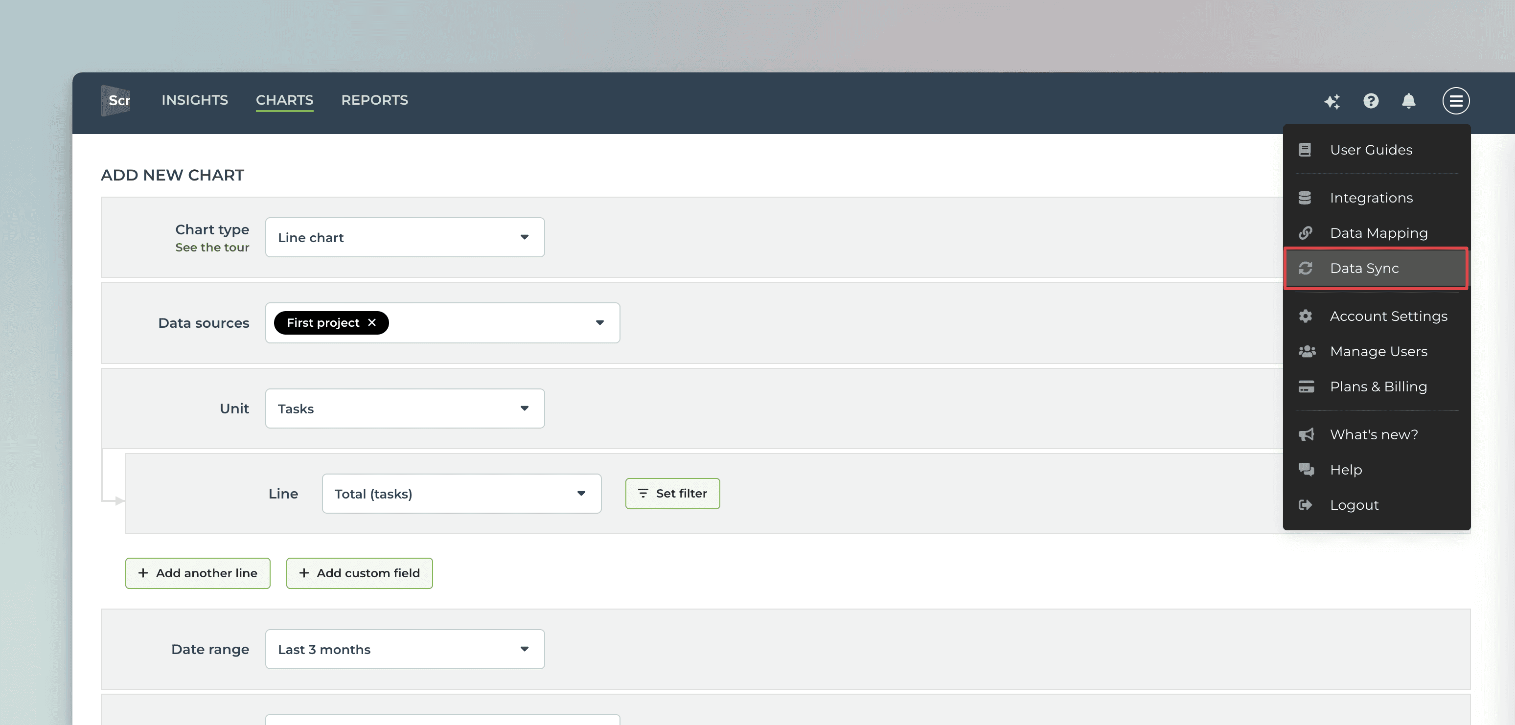
All data sources are synced automatically once per hour. Changing settings or configuration will trigger additional sync so your data is at most one hour old. You can sync data manually at any time in the sync settings:
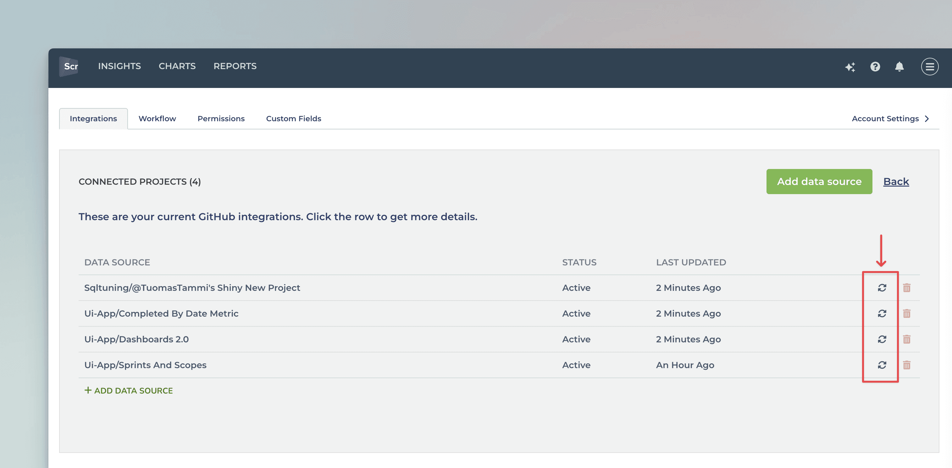
You'll see a list of current integrations, and you can trigger a sync by clicking the sync icon:
All data sources are synced automatically once per hour. Changing settings or configuration will trigger additional sync so your data is at most one hour old. You can sync data manually at any time in the sync settings:
You'll see a list of current integrations, and you can trigger a sync by clicking the sync icon:
Yes, you can use custom fields as units, or for grouping and filtering data. Learn more from the integration-specific guides:
Yes, you can use custom fields as units, or for grouping and filtering data. Learn more from the integration-specific guides:
Does this support my specific workflow or do I have to use some specific states like "open", "in progress" and "done"?
You are not limited to any specific set of states or a workflow. You can configure your own workflow, if such exists, and you can use that in your reporting. It's also ok if you don't have any workflow in your boards, as can create reports based on any other criteria by setting a filter.
You are not limited to any specific set of states or a workflow. You can configure your own workflow, if such exists, and you can use that in your reporting. It's also ok if you don't have any workflow in your boards, as can create reports based on any other criteria by setting a filter.
You can embed any custom chart or report to any web page using the embed code. Learn more about the sharing feature from the online guide.
You can embed any custom chart or report to any web page using the embed code. Learn more about the sharing feature from the online guide.
Currently, we don't support tracking comments on tasks. Let us know if you'd like to see us supporting them in our analytics.
Currently, we don't support tracking comments on tasks. Let us know if you'd like to see us supporting them in our analytics.
You can manage the subscription in the billing settings. The location of the billing settings depends on the product you are subscribed to. You can learn more by following the instructions in this guide.
You can manage the subscription in the billing settings. The location of the billing settings depends on the product you are subscribed to. You can learn more by following the instructions in this guide.
The Getting Started Guide contains Instructions for setting up Screenful.
See also our Accounts & Pricing FAQ or ask our AI assistant.
Check out our knowledge base and video tutorials, or get in touch by emailing support@screenful.com
The Getting Started Guide contains Instructions for setting up Screenful.
See also our Accounts & Pricing FAQ or ask our AI assistant.
Check out our knowledge base and video tutorials, or get in touch by emailing support@screenful.com
Troubleshooting
Workflow states are based on your board columns, not Jira status. When you group or filter by workflow state, the available options are the board columns. However, you can also group and filter by Jira status, which will use the status field instead of the board column.
Workflow states are based on your board columns, not Jira status. When you group or filter by workflow state, the available options are the board columns. However, you can also group and filter by Jira status, which will use the status field instead of the board column.
If the Jira board you are looking for is not visible in the data source creation wizard, the most common reasons are the following:
1 You have entered an incorrect URL. To authorise access to the Jira API, you need to provide the base URL of your Jira instance. If you're a Jira Cloud user, the base URL is the part that ends in atlassian.net e.g. https://mycompany.atlassian.net. Once authorized, you get to select the individual board.
2 The user you’re using to authorize the connection does not have access to that board. If you’ve installed Screenful from the Atlassian Marketplace, check this guide. If you’ve installed Screenful as a stand-alone web app via the Screenful website, start from here.
3 The boards you are looking for are not standard Jira software boards that can be imported. See the following guides for importing Jira Service Management projects, Jira Work Management projects, or Jira Product Discovery projects.
If your credentials are correct but the authorization fails, it could due to any of these issues:
If you’re connecting to Jira Cloud, you need to create and use an API token instead of password
Your API token may be expired (tokens expire in one year). Create a new API token.
If you are re-authorizing an existing data source, you must have access to that Jira board (on Jira side).
If you’re trying to connect Jira Service Management boards, see this guide.
If you’re trying to connect Jira Work Management boards, see this guide.
If you’re trying to connect Jira Product Discovery boards, see this guide.
Jira sprint reports exclude sub-tasks. You can set a filter to match this. Note that the Jira sprint report data is not available from the Jira API, which may also lead to small discrepancies.
Jira sprint reports exclude sub-tasks. You can set a filter to match this. Note that the Jira sprint report data is not available from the Jira API, which may also lead to small discrepancies.
1. Go to Settings ► Integrations ► Jira
2. Click on the "Disable integrations" button
3. Enter the new credentials and click on "Connect" button
1. Go to Settings ► Integrations ► Jira
2. Click on the "Disable integrations" button
3. Enter the new credentials and click on "Connect" button
Here's are step-by-step instructions for authorising access to the Jira API and for setting permissions for the Jira Cloud add-on
Here's are step-by-step instructions for authorising access to the Jira API and for setting permissions for the Jira Cloud add-on
You'd need to close your account at (Account->Billing tab) first before signing up to another account using the same email address. You can't attach an existing Screenful account to the Marketplace add-on, unfortunately.
You'd need to close your account at (Account->Billing tab) first before signing up to another account using the same email address. You can't attach an existing Screenful account to the Marketplace add-on, unfortunately.
I installed your marketplace add-on but can’t create data sources because of an authorization failure
Reinstalling the add-on might help in this case. You need to stop the trial first, and then uninstall the add-on. After that, you can install it again and continue with your trial.
Reinstalling the add-on might help in this case. You need to stop the trial first, and then uninstall the add-on. After that, you can install it again and continue with your trial.
If you try to install the add-on with a direct link you may get an error message like “Add-on key is invalid”. Most likely this means that you’re not logged in to Jira with sufficient administrator privileges to install add-ons. Check your permissions or cantact your Jira admin.
If you try to install the add-on with a direct link you may get an error message like “Add-on key is invalid”. Most likely this means that you’re not logged in to Jira with sufficient administrator privileges to install add-ons. Check your permissions or cantact your Jira admin.
Two common scenarios could cause the difference. First, if any Jira columns are excluded in Screenful workflow settings, issues from those Jira columns won't be imported to Screenful. In addition, if there are Jira statuses that are not mapped to any Jira column in the Jira board configuration view, issues with those statuses are not imported to Screenful.
Two common scenarios could cause the difference. First, if any Jira columns are excluded in Screenful workflow settings, issues from those Jira columns won't be imported to Screenful. In addition, if there are Jira statuses that are not mapped to any Jira column in the Jira board configuration view, issues with those statuses are not imported to Screenful.
A firewall maybe blocking Screenful from accessing your Jira API. You need to enable access.
A firewall maybe blocking Screenful from accessing your Jira API. You need to enable access.
While both the public and private channels are shown in the menu, you won’t receive the report to a private channel without explicitly adding the Screenful app to that channel. Learn how to enable sending to a private Slack channel.
There can also be restrictions on who can install apps to your Slack. Learn how to manage app approval in your Slack workspace.
Some browser plugins may interfere with the authorization process. If you see an empty page during the authorization or the list of channels is empty, you should try with another browser (or ask your colleague to do the Slack authorization).
Filter options are derived from task data, which means that if you recently added some properties, such as labels, but haven't yet assigned them to any tasks, they won't show up in the filter options. As soon as you assign them to tasks, they will show up in the filter options from then on.
Filter options are derived from task data, which means that if you recently added some properties, such as labels, but haven't yet assigned them to any tasks, they won't show up in the filter options. As soon as you assign them to tasks, they will show up in the filter options from then on.
If the invited person says that they didn't receive the invitation, you can either resend it or copy the invitation link and share it manually.
Select Manage users from the main menu
Select the invited user from the list
Click Copy invitation link
Send the link to your colleague
Learn more from the user invitation guide.